Project Overview
Project type: Research & Strategy
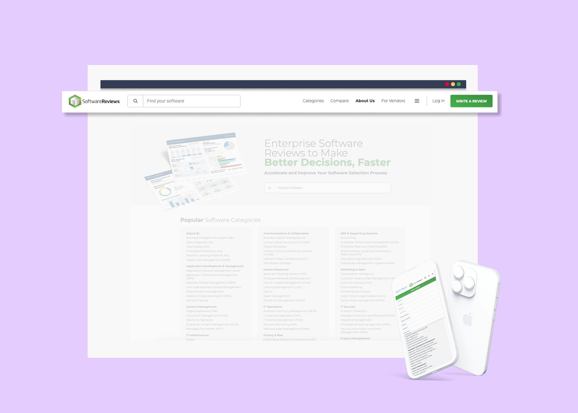
Product: SoftwareReviews Website
Company: SoftwareReviews
Timeline: 5 weeks (November 2023)
Role: UX Designer
Team: Collaborated closely with UX Director, Design Director & Director of Product Development
Platform: SoftwareReviews.com
Deliverables:
-- Project Planning & Roadmap
-- Data Analysis & Insights / Google Analytics & Hotjar
-- Competitive Analysis / Software Category Listings
-- Navigation Recommendations, Information Architecture Map
-- Wireframes
-- Data Analysis & Insights / Google Analytics & Hotjar
-- Competitive Analysis / Software Category Listings
-- Navigation Recommendations, Information Architecture Map
-- Wireframes
Current State | Navigation Desktop & Mobile
Optimizing Navigation
_______ for improved software discovery
SoftwareReviews is a platform that provides comprehensive insights into software solutions through user-generated reviews, expert analysis, and benchmarking data. It caters to IT professionals offering valuable information for software evaluation and selection.
As part of an ongoing effort to improve the user experience on SoftwareReviews.com, following the successful implementation of the search feature, the next focus on the product roadmap (even though not a top priority) was to optimize navigation, facilitating easy content discovery for platform users.
As a UX Designer, I led discovery and ideation, collaborating with the UX Director, Design Director, and Director of Product Development. Despite the project's low priority on the roadmap, I used this opportunity to explore both quantitative and qualitative data, providing recommendations and ideas that could guide future design iterations.

With a 90% increase in organic traffic, users on SoftwareReviews platform face challenges in finding and discovering software.
This limits engagement and traffic on software category and product pages impacting user access to insights and user-generated reviews that contribute to the company’s offerings.
Research Goals

What were the goals?
The primary research objective was to understand user behavior and preferences when navigating the SoftwareReviews website. This involved identifying user groups, exploring navigation patterns, and recommending design improvements.
Key questions included:
-- Who are the primary and secondary user groups?
-- What are common navigation patterns and software category classifications in the market?
-- How can we enhance navigation while maintaining existing pages?
Research Methodology

Quantitative Research:
-- I examined various metrics within Google Analytics, including traffic patterns, keyword searches, page engagement, and user attributes. The focus was to explore the user 5W's (Who, What, Where, When, and Why), forming assumptions and proto-persona creation due to initial user base ambiguity.
Qualitative Research:
-- Leveraged Hotjar to gather qualitative insights through heatmaps and session recordings, complementing the quantitative data.
-- Conducted competitor analysis to identify common navigation themes and software category listings.
Audit Current State Navigation:
-- Conducted an audit of the current navigation system, examining information architecture and taxonomy.
-- Explored how users interacted with existing pages in the top navigation and identified patterns in category usage.
Analysis & Synthesis
_______User 5W's
-- Who is the user?
-- What are the current habits?
-- Where and when does the user use the product currently?
-- Why do they use the product?

-- Who is the user?
I identified two broad user types:
-- Primary User (Direct User): Users familiar with the brand, arriving at the homepage via URL. This group comprises vendors, analysts, paying members and individuals interested in writing reviews. Data indicates that more than half of the users entering the site directly, fall into the category of those interested in writing reviews representing an opportunity to tailor software categories for their specific needs.
-- Secondary User (New User): Unfamiliar with the brand, arriving from search engines or referral links. This group, experiencing a 90% surge in organic traffic, seeks to find and compare software options, also representing an opportunity to tailor software categories for their specific needs.
-- What are the current habits?
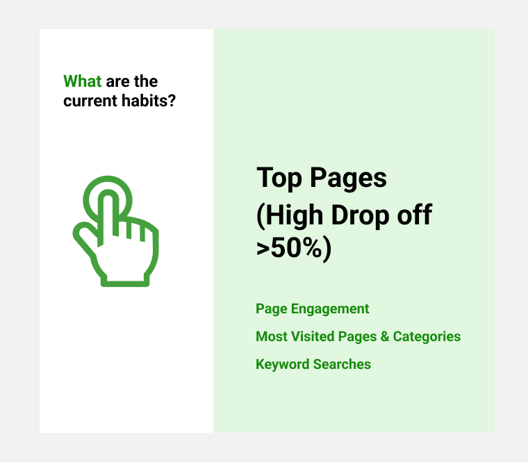
-- Analysis of page engagement revealed high drop-off rates (>50%) and lengthy average time spent on pages (avg. 10 min), suggesting unmet user expectations.
-- Users spend an average of 37s on the homepage and 54s on the Category page, relying heavily on the search feature for software discovery, indicating potential issues with category visibility.
-- Some search queries align with competitor category listings, indicating similarities in searching behavior.
-- Users utilize filters on category pages, visit product pages, and navigate between categories and products, suggesting flow issues and an increased abandonment rate.

-- Where and when does the user use the product currently?
Users access the website equally via mobile and desktop, predominantly using Chrome and Android devices, emphasizing the importance of responsive navigation.

-- Why do they use the product?
Users primarily search for software to aid in discovery, leave reviews, or download reports, highlighting their intent and objectives when engaging with the platform.
_______Competitor Analysis
I conducted a competitor analysis by examining the navigation patterns and software taxonomy of three competing platforms.

Insights:
-- Competitors employ mega menus, while SoftwareReviews utilizes a traditional navigation menu with dropdown options.
-- Competitors' navigation systems facilitate software discovery through clear and concise labels, reducing the steps needed to explore different software categories.
-- When comparing SoftwareReviews with competitors, common themes in software taxonomy emerge, suggesting similarities.
Key Insight: Competitors use clear categorization labels tailored for both end-users and enterprise users, whereas SoftwareReviews primarily targets enterprise users in its category classifications.
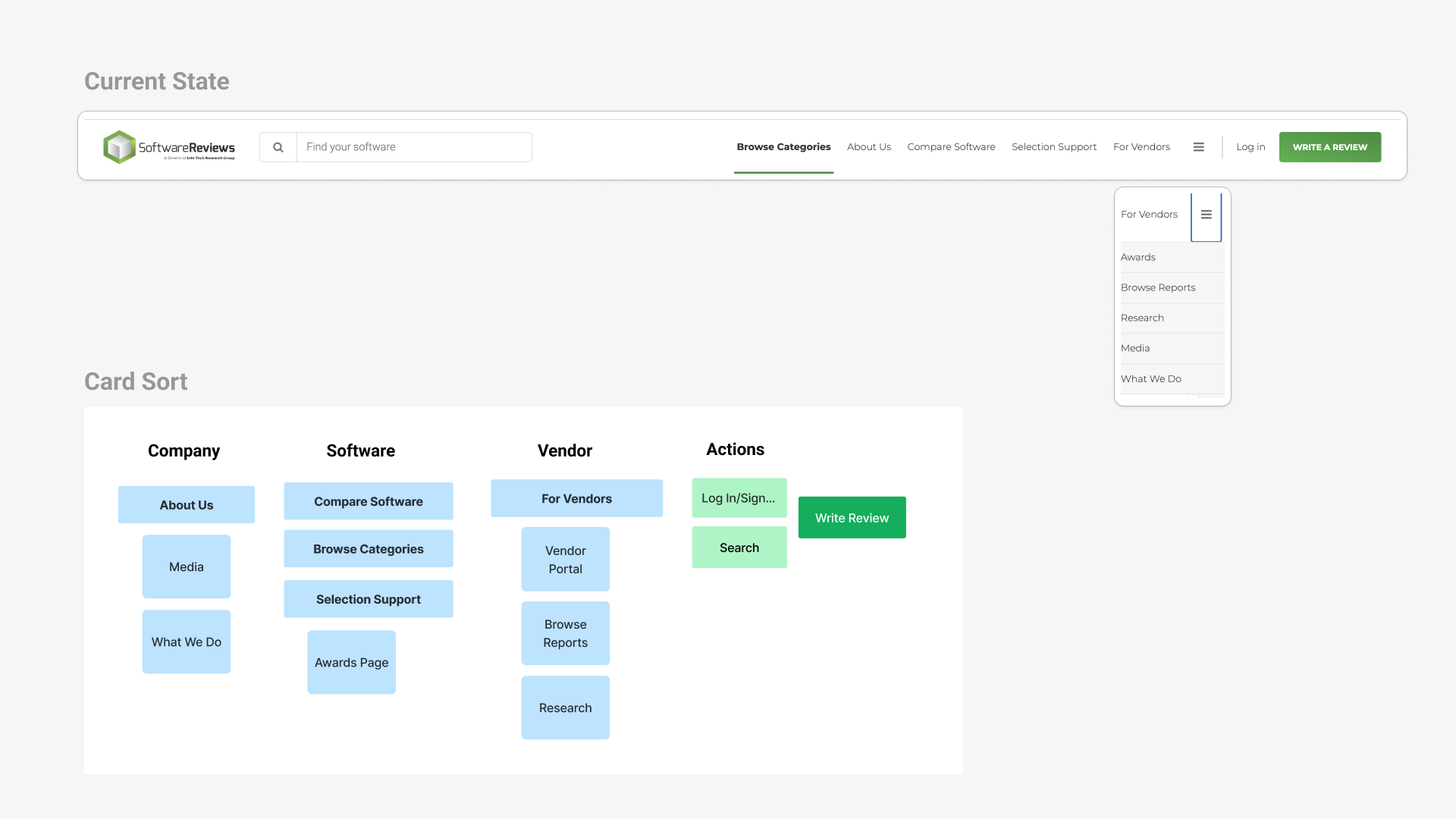
_______Current State Navigation
__Additional Pages Linked in Navigation
Upon reviewing the current state of the navigation, I conducted card sorting exercises, and it became clear that the organization of pages linked in the main navigation lacked coherence based on similar content. This lack of organization may lead to user confusion and a sense of being lost while navigating the platform.
__Software Category Groupings Analysis
Insights:
1. My analysis began with the examination of popular software categories on the homepage. I observed recurring themes such as IT and Marketing, suggesting a need for additional labels to improve information scanning. I also compared these themes with competitors' navigation, identifying similarities and discrepancies.
2. During this comparison, I noticed that certain categories like Customer Service, Finance, and Education were absent from our popular categories but were frequently searched by users on our platform. This indicated a demand for a wider range of software beyond enterprise solutions, including productivity tools, banking, gaming software, and award-winning products.
3. Further analysis involved comparing our directory page with competitors' listings. This revealed variations in how themes were grouped, with some competitors organizing categories similarly to SoftwareReviews while others differed. For instance, while Sales and Marketing were grouped together on our website, some competitors had Sales categorized separately or combined with Customer Service.

Recommendations
Based on the 90% surge in organic traffic, the recommended solution is prioritized for a new user who is not familiar with the SR website. However, direct users are very important too and so the solution needs to take into account both user groups. Ultimately the final decision needs to be made based on the business goals, if bringing traffic to the website is still a valuable strategy for the business model. The research I conducted shows that there are other interests in software from end-users though.

Additional Navigation Pages
Pages in the primary navigation can be organized based on key themes such as software, user types (end-user, vendor), company information, and essential actions like search or logging in. Less frequently accessed pages can be relocated to the footer to streamline navigation and eliminate potential confusion caused by the hamburger menu.

Software Groupings Recommendation:
By integrating themes like Banking, Customer Service, and Productivity alongside existing categories such as Marketing, IT, HR, and Development in the navigation, both end users and enterprises can be better served. Clear labeling of these themes will facilitate users in quickly scanning and locating categories of interest. Additionally, merging some categories from the directory listing page with themes derived from search queries will maintain consistency and enhance discovery for new and existing users.
The proposed software categories are organized into six main labels: Banking & Finance, Development, Enterprise & Midmarket, Human Resources, Information Technology, and Marketing, Sales & Service, which can be further simplified for user understanding. Additionally, a category for "Other" can be included to encompass themes like Communication, Collaboration & Productivity, Education, and Gaming & Hospitality based on user searches, while integrating an "Awards" or "Most Popular" category can enhance page visibility and aid in discovery.

Ideas/ Wireframes
After meetings with stakeholders, I iterated through various ideas, exploring different structures and layouts for arranging software categories and other pages in the main navigation. Feedback sessions led to adjustments, including placing Reports links in the main navigation and Write Reviews CTA in the footer. While considering mega menu UI patterns and feedback from stakeholders the focus was on unified solutions for end-users and enterprise users.
Throughout my design iterations, I utilized color to highlight the hierarchy between software discovery and other actions. The primary aim was to propose a solution for the category groupings that could be further explored and tested. Below are six iterations, starting with the initial two. In these options, the category groupings are organized in either an 8 or 7 column layout, with 4 to 8 links listed for each classification based on current listings. While this approach offers an overview of software categories, it may pose limitations in discovering software and could potentially overwhelm users by displaying all information at once.


The following two alternatives investigate layouts with fewer columns. The first option removes the main grouping label, while the second option shows interaction possibilities.
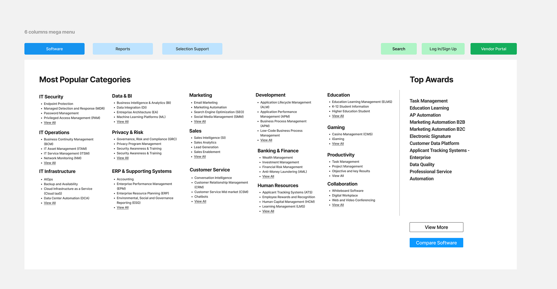

The final approach adopts a 5-column layout, integrating an interactive mega-menu pattern featuring 6 primary software groupings subdivided into categories. This design streamlines software discovery, aligning with business objectives and increasing page visibility. Each grouping contains 8 to 12 links, optimizing user cognitive load through a 3-column layout. This strategy facilitates navigation, enhances software discovery, and allows for scalability with future category additions.
Stakeholders approved this approach for further iteration, suggesting the creation of an interactive prototype for user testing. This option would also need to be implemented into mobile, so testing would be important in determining what is the most essential information.

Next Steps
-- The next steps involve engaging with analysts from the data ops team to gather additional insights on the category classification based on the findings. This will help uncover any overlooked aspects and ensure comprehensive understanding of the current state.
-- Conducting a tree test on the proposed Information Architecture will be crucial for validating its effectiveness in classifying software categories and other pages in the main navigation. Participant recruitment will align with criteria from the proto-persona identified to ensure relevant feedback.
Reflections
What went well:
-- Collaboration with stakeholders provided valuable domain knowledge, immediate feedback and establishing advocacy for user research.
-- Access to data analytics enabled the formation of assumptions and hypotheses for future testing, contributing to informed decision-making.
-- Positive stakeholder feedback acknowledged the project's high-level understanding and effective presentations.
-- Initiating discovery ahead of the product roadmap allowed for exploration without the pressure of immediate solution delivery in active sprints.
Challenges:
-- One challenge encountered in this project was the risk associated with dependency on data analytics for design recommendations. Although I suggested tree testing as a follow-up step, its implementation might be overlooked due to lower prioritization on the roadmap, potentially leading to finalizing recommendations without validation. The absence of a persona repository exacerbates this issue, particularly in an agile environment, where user ambiguity could pose future challenges.
-- The lack of clarity surrounding the business model has implications for defining the target audience and shaping the existing strategy. Despite a focus on content tailored for enterprise users, uncertainty remains regarding the strategy for driving website traffic to support software insights.
-- Lack of defined success metrics for the navigation initiative limits the ability to measure its effectiveness, emphasizing the need for careful hypothesis formulation and testing to evaluate outcomes accurately.