Project Overview
Project type: Heuristics & Interaction Design
Product: Vendor Portal
Company: SoftwareReviews
Timeline: 2 months 2023
Role: UX Designer
Team: Collaborated closely with UX Director, Design Director & Product Designers
Problem: User and stakeholder feedback indicated that manage team process in Vendor Portal is confusing.
Solution: Redesign the Manage Team feature to clearly indicate tasks like “add a team member” and “edit team members” including user’s roles and permissions.
Impact: Clear task instructions like adding and editing team members enhanced efficiency by reducing confusion, gaining stakeholder approval for implementation.
Deliverables:
-- Heuristic Evaluation
-- Task Flows
-- Wireframes & Prototypes
-- Component Library, Documentation
-- Presentation
-- Task Flows
-- Wireframes & Prototypes
-- Component Library, Documentation
-- Presentation

Future State | Manage Team
Managing team members
_______ for faster and accurate task completion
The SoftwareReviews vendor portal enables software vendors to manage profiles, submit products, and engage with users, offering tools for showcasing products, responding to reviews, and accessing analytics for performance tracking.
Following the platform launch, the UX team was asked to evaluate the Vendor Portal interface therefore suggesting improvements for enhanced usability. While initial user feedback was largely positive, we encountered significant challenges related to usability issues when adding or editing new team members, leading to user confusion.
As the UX Designer for this project, my role involved conducting heuristic evaluations, brainstorming solutions, and providing design recommendations. I collaborated closely with the design director, UX director, and two product designers to achieve our objective: alleviate user confusion by proposing design changes that require moderate to low effort in implementation but have significant positive impacts on the user experience.
Challenge: Memory Load
User feedback highlighted confusion in the team management process, while a heuristic evaluation revealed significant issues in usability. "Recognition rather than recall" and "Visibility of system status" were predominant heuristic violations, indicating that users were required to remember or learn necessary steps in accomplishing tasks.
Recognition rather than recall
Studies have shown that recognition-based tasks, where users are presented with options and choose from them, typically impose a lower cognitive load compared to recall-based tasks, where users must retrieve information from memory without cues.
Research
Heuristic Evaluation:
-- While reviewing the portal's interface, I came across "Manage my company profile" page and discovered significant usability issues within the "Add a team member" feature. This problem had also been flagged by users during feedback sessions following the platform's launch.

User Persona Vendor Portal
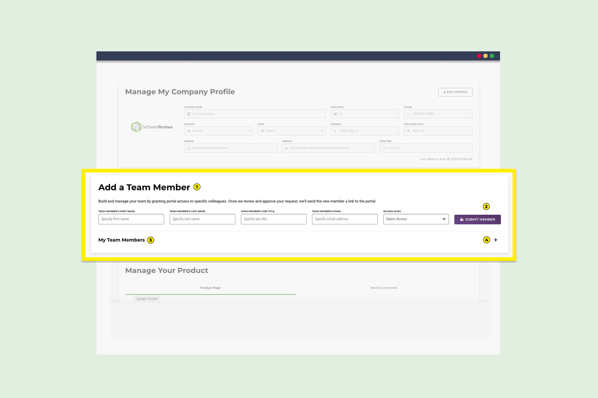
Current State Vendor Portal | Add a Team member

Upon examining the feature, I identified nine usability issues of varying severity. Among these, the heuristic "recognition rather than recall" was present in six out of the nine issues, while the "visibility of system status" heuristic was observed in five issues. Unclear labels and inconsistent actions contributed to the complexity of tasks such as adding a member or managing team access levels, while the absence of messages and cues in the interface elevated ambiguity and confusion. The most critical usability issue involved the use of the "+" sign intended with the functionality to expand/view the list of team members without any accompanying cues in the interface. This was particularly confusing as the same "+" sign was used with the intent "to add" throughout the interface, except in this context.
To better understand usability concerns from the viewpoint of persona, I examined both the current user flow of the "manage company profile page" and the primary task flow in the "add a team member" section. I observed a lack of feedback mechanisms, such as success or warning notifications, and identified confusion regarding user navigation after completing tasks. This emphasized the importance of users having a clear understanding of the outcomes of their actions and maintaining control over them.

Task Flows & UI Board
Solution
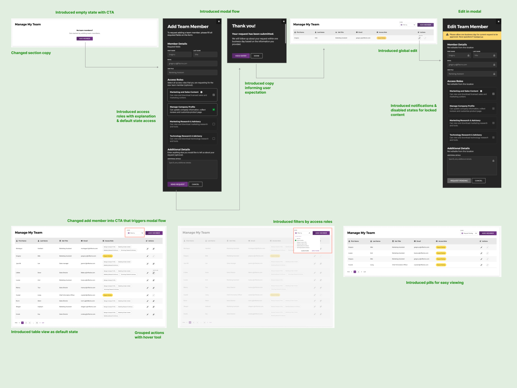
-- After having a good understanding of the current state I wanted to explore existing UI patterns within similar software products, to streamline tasks such as granting access levels, adding new members, and editing member information. Exploring various ideas within the interface's existing context and component library, I considered options requiring minimal development effort as well as alternative approaches. Following presentations and feedback sessions, stakeholders approved a modal flow concept I proposed. This approach ensures user focus, clarity, and control over adding and managing team members' access roles and permissions.

Prototype Iterations in Figma

Modal Ideas: Flow Empty State & Returning User | Adding new member & Editing member
Design Constraints
After examining the SoftwareReviews design system and component library, I encountered limitations in designing the modal. The initial solution proposed a modal on a white background, utilizing current components from the library. However, after consulting with a developer, I learned that existing modals on the website had a dark background due to branding decisions. This posed challenges for users transitioning between light and dark themes, increasing cognitive load. To address this, I ensured the modal's grid design maintained accurate proportions divisible by 8 for scalability and layout consistency, while using an inner scroll option for increased visibility. Additionally, I had to create inverted components for consistency, collaborating with a product designer to determine the best approach. This process involved decisions on typography, grid spacing, input fields, buttons, error states, and notifications, presenting significant challenges throughout finalizing the solution.

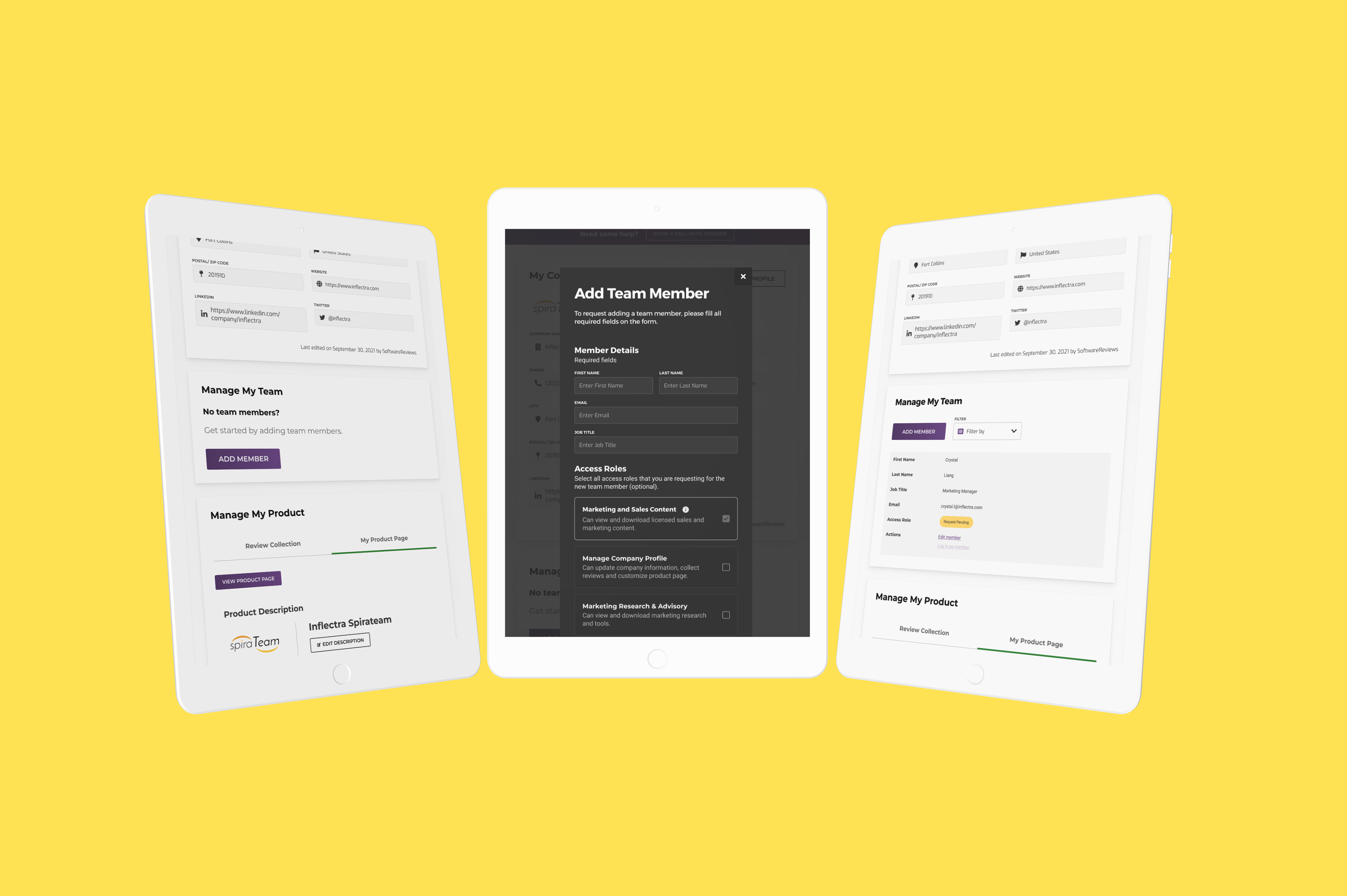
Final Modal Design

Future State Add Team Member

Future State Manage Team Members
Design Changes
Created high fidelity wireframes and prototypes while working with the constraints of the SR design system
Added modal form to improve the experience of added member:
-- Introduced copy explaining access levels
-- Success & warning notifications
-- Contact option
-- In order to minimize the effort on implementation we used existing UI components: dark modal, table, pills, filter
-- Introduced copy explaining access levels
-- Success & warning notifications
-- Contact option
-- In order to minimize the effort on implementation we used existing UI components: dark modal, table, pills, filter
Improved Navigation:
-- Removed the + sign and added View all button for mobile & tablet views
-- Improved the flow of add a team member
-- Improved searching by access level
-- Removed the + sign and added View all button for mobile & tablet views
-- Improved the flow of add a team member
-- Improved searching by access level
Copy
-- Removed description copy
-- Replaced title section with “Manage My Team”
-- Removed description copy
-- Replaced title section with “Manage My Team”
Improved Actions
-- Add a member as a main action
-- Secondary action filter by access levels
-- Global user edit
-- Add a member as a main action
-- Secondary action filter by access levels
-- Global user edit
Improved table UI
-- Improved search by adding a filter by access levels with new UI elements
-- Grouped actions together
-- Improved search by adding a filter by access levels with new UI elements
-- Grouped actions together

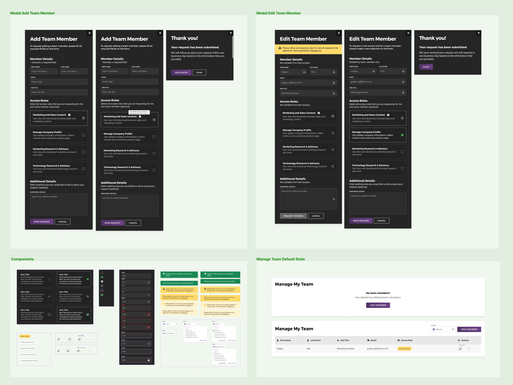
Final Components
Add Team Member Flow Prototype
Filter Member by Access Levels Prototype
Next Steps
-- The implementation of the design solution hasn't been decided as this will depend on the business priorities.
-- Gathering user feedback will be important for evaluating the proposed solution and its impact on memory load, particularly during the switch from light to dark mode.
-- While stakeholders and the design team have endorsed this solution, measuring its impact on users post-implementation will provide the most accurate assessment of its success.
Reflections
What went well:
-- Collaborating closely with product designers and developers provided invaluable insights into the evolution of the brand and facilitated a shared understanding of the evolution of the component library.
-- Being entrusted with decision-making responsibilities regarding the product user interface allowed for thorough evaluation and refinement, influencing final visual designs.
-- Receiving positive feedback from stakeholders reinforced the importance of advocating for the user throughout the design process.
Challenges:
-- One significant challenge encountered was the evolving nature of the component library and design system. While decisions were made based on brand aesthetics, certain design choices, such as typography and form styles, impacted user cognitive abilities. Advocating for changes that affect the entire product and development process required substantial time and effort. Aligning designers and developers in the decision-making process is crucial to avoid redundancy and optimize efficiency. Moving forward, advocating for regular updates to the design system, detailed documentation and fostering a collaborative environment between UX and other teams is essential.
-- Another challenge was the lack of clarity surrounding access roles and permissions from the business. Adding team members required paying for additional seats, which was not clearly communicated to users. Addressing this issue involved informing users through clear copy in the form that adding a member requires a request to the sales team. However this is still not entirely clear and the lack of transparency in this regard risks eroding trust in the brand.
-- The fluctuating roadmap priorities in an agile environment are a challenge in measuring impact and establishing a clear strategy for defining a cohesive product experience.